January 2018 John S Knight Center Booth Design Awards
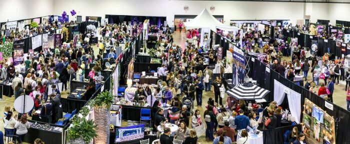
With over 150 vendor booths at our Akron January Bridal Show, the designs can easily begin to blur together. These 5 booths, though, stood out as incredible examples of both creativity and professionalism! With their use of space, backdrops, lighting, and decor, we’re happy to announce them as the Booth Design winners for the 2018 January Today’s Bride Show in Akron at the John S. Knight Center.
acme fresh market

If you haven’t heard by now, Acme Fresh Market made it very clear that Ultraviolet is Pantone’s color of the year! Showcasing all of their offerings – from catering to flowers to cakes – Acme made a cohesive booth where couples could easily imagine using all of their services at their own wedding! The levels of their tables, centerpieces, and banners created dimension and perspective. Carpeting added warmth and formality to an otherwise industrial convention center. It was inviting for attendees to stroll through and experience all things Acme. Bravo!
the bouquet shop
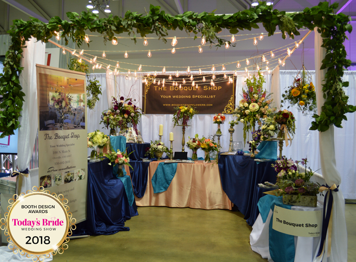
This structure ensured that The Bouquet Shop stood out among the booths surrounding them. Embracing the newest trend of hanging floral arrangements, they draped greenery along the front of their booth and used modern geometric chandeliers to display their work. Their company name was easily visible at the front of their booth, hanging in the back, and on their banner. The U-shape placement of their tables created a sort of gallery of floral possibilities while also leaving them space to speak with potential clients. Well done!
buchwalter greenhouse
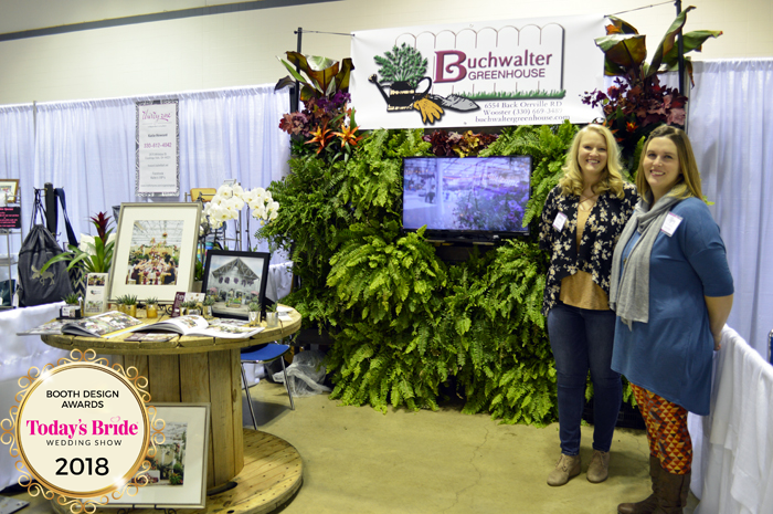
Buchwalter Greenhouse lived up to their name with this fun, fragrant booth design! Brides and grooms got to feel as if they were in the greenhouse with this awesome plant wall. Floral and greenery walls are a super popular trend, making this backdrop even better! They made sure that their company name was clearly visible, brought beautiful photos to show off their space, and left the right amount of space for couples to feel welcome to come into their booth to have valuable conversations about their reception venue space.
olivia d wenger photography
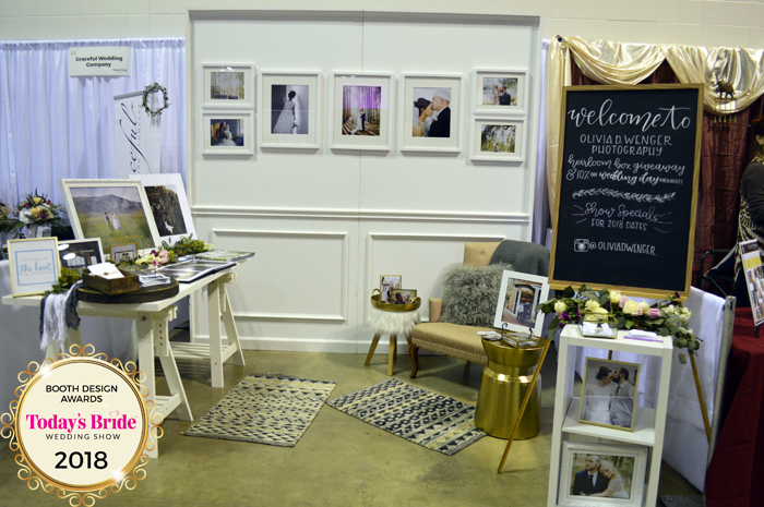
Olivia D Wenger Photography replicated a bride’s home right there at the show! Her wall backdrop, cozy chair and end table, and stylish rugs and decor allowed brides to dream of the day when they can hang their wedding photos up in their own home. Her talent was present everywhere you looked with framed photos and albums, and her signage was prominently displayed at the front of her booth offering a show special and encouraging social media followers! Brides had an idea of Olivia’s personality and experience with one glance at her booth. Impressive!
sitting pretty linens

As one of the first booths in the upstairs convention space, it’s important to make a dramatic first impression! Sitting Pretty Linens didn’t disappoint with their over-sized, draped backdrop, chandelier, and mantle. Their use of uplighting created a glamorous and luxurious space which showcased their many services from tablecloths and runners to seat covers, chair ties, and napkins! And yet, with all of this, they somehow managed to create an open space that didn’t feel crowded or overwhelming, but welcoming and inviting. What you don’t see were Amanda & Jeramy’s attire which complemented the booth’s theme and epitomized elegance. Perfect example of veteran exhibitors continuing to reinvent and inspire. Great job, SPL!

